Advanced UI elements (data grid, sitemap, tree pane)
On this page
Some UI elements have more powerful text editing capabilities that are worth describing in more detail.
The data grid (table) element
The Data Grid element functions like many other text-based elements. It uses commas as column separators and new lines as rows. A basic table with three columns and two rows would look like this:
First Name, Last Name, Email Address
firstname, lastname, email@email.com
You can choose whether to show the first row as a header row in the Property Inspector, as well as specifying the row height, row colors, and grid lines.
Text in the Data Grid can be formatted as bold, italic, etc. from the Property Inspector.
You can also include icons within your text by enclosing the icon name in colons like this :arrow-up:
Column width options
Balsamiq lets you specify individual width and alignment options for each Data Grid column.
Here are the details for creating column widths:
- You have to add a special line of text as the last line of text in your table, and it has to be wrapped by { } curly brackets
- For each column, use 0 if you want the column to be as small as possible to fit the text in that column, or a number
- Numbers specify the relative size of columns, so {2,1} means "make the first column twice as big as the second one in this two-column grid. Or {70,20,10} means "in this 3-column grid, make the 1st column 70%, the 2nd 20% and the 3rd 10% of the width of the whole table.
- You can combine numbers and zeros, e.g., {1,0,4}
- If you want to align columns individually, add either L, C or R right after a number, like so: {0R,2L,1}, which means "in this 3 column grid, make the 1st column as small as possible and always align it to the right, the second twice as big as the third and always align it left, and use the Data Grid's alignment (from the property inspector) to decide how to align the 3rd column".
Using icons and selection controls in a data grid
Data Grid supports sort icons in headers using the following text:
- Ascending: ^
- Descending: v
- Both: ^v
Data Grids support a single checkbox or radio button in a table cell using the following text:
- Checkbox: [] or [ ]
- Selected checkbox: [x] or [v] or [o] or [*] or [X] or [V] or [O]
- Indeterminate checkbox: [-] or [=]
- Radio button: () or ( )
- Selected radio button: (x) or (v) or (o) or (*) or (X) or (V) or (O)
- Indeterminate radio button: (-) or [=]
Creating line returns in a data grid
Sometimes you want to create line returns in a table cell. To do this, you can use "\r" to create a line return.
The code example below would print on two lines.
Name\r(job title)
This technique can be used to make room for placing larger elements inside a Data Grid.
Creating multiple header rows
You can create a data table grid with two levels of header rows by creating two tables and grouping them together.
Pasting data from Excel
Some people like to prepare tables in a spreadsheet application like Excel. You can copy and paste a range of cells directly from Excel into the Data Grid/Table component. Just copy/paste and it will just work. It also works in the opposite direction from Balsamiq to Excel.
Note: If you have commas in your cells, you will have to escape them with a backslash like this: 1\,000\,000
The component recognizes both commas and tabs as delimiters. Anything else should be populated into cells.
The site map element
You can create simple site maps from a text outline using the Site Map element.
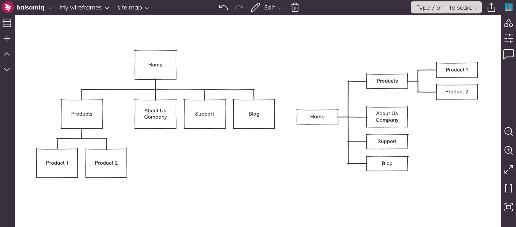
Edit the Site Map element by double-clicking or selecting it and pressing ENTER. Edit the outline to create parent-child relationships. Each line represents a box (or page/node) in your sitemap. Use hyphens to indent child boxes beneath a parent. Here's an example:
Home
- Products
-- Product 1
-- Product 2
- About Us\rCompany
- Support
- Blog
Using the Property Inspector, you can add links to the nodes in the map and change the text properties and orientation of the map (vertical or horizontal).
This is what the outline above looks like in vertical (default) or in horizontal orientation:
Generating site maps automatically
Next to the options for changing the orientation in the Property Inspector is a button that allows you to automatically populate a site map based on the order and structure of your boards in the boards Panel.
Each time you click the "Populate from Project" project the site map will be updated to reflect the current project structure.
If you are using a parent-child hierarchy, child boards will be shown as child nodes in the site map, as shown below.
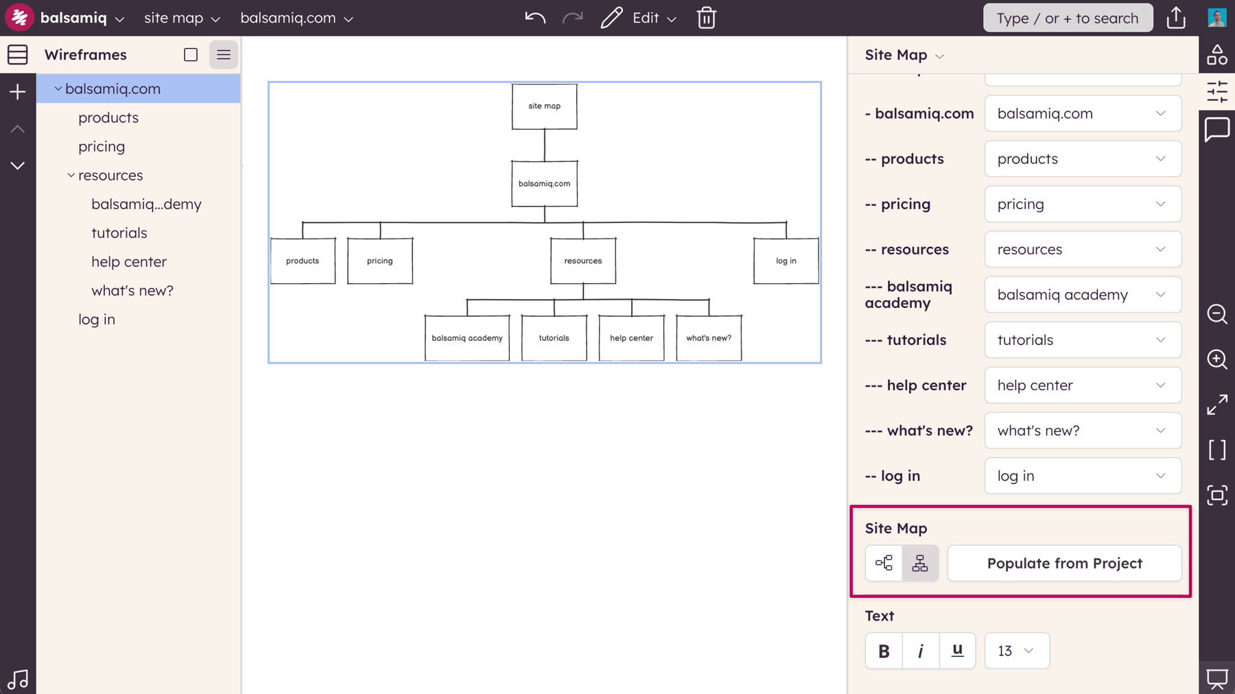
Links will be added to each node in the site map to the corresponding board in your project.
Notes and options
- Single Tree Support: Site Map expects the first line to be the top-most parent, and only one of these can exist because it only makes a single tree. If you want to make multiple trees, just add more Site Map elements.
- Multi-Line Text: You can use \r to create line returns on text in a box like this: About\rUs
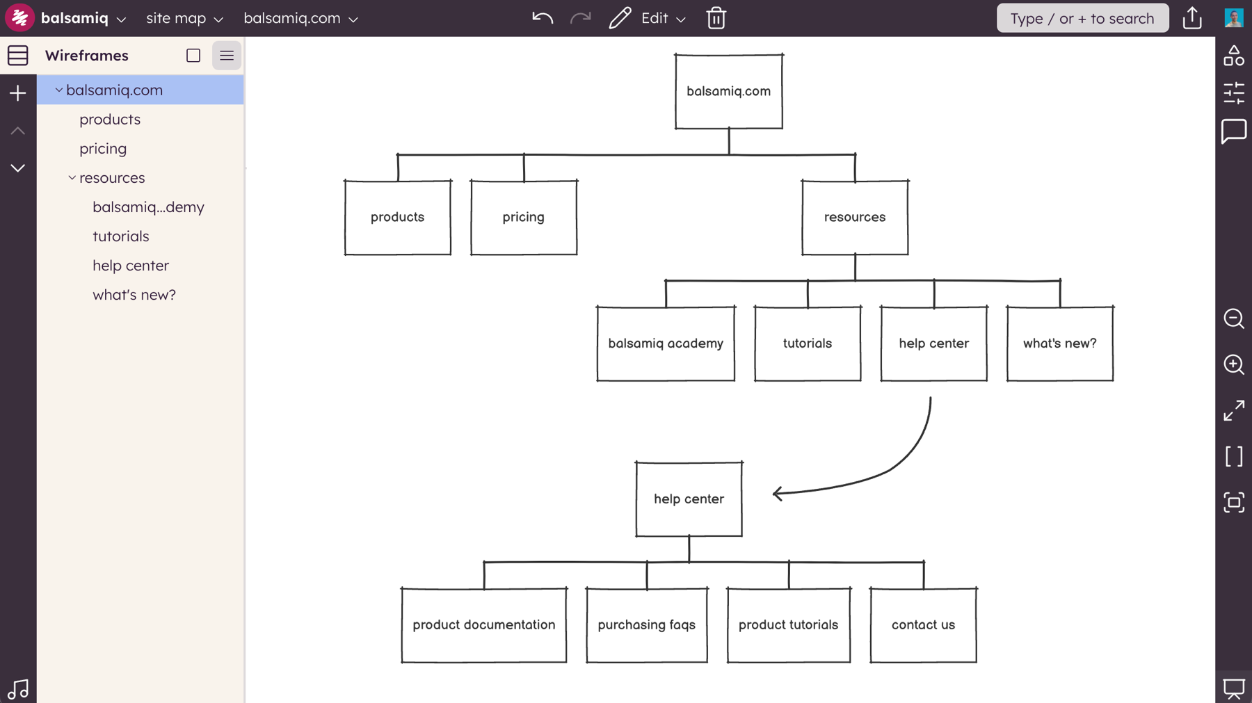
- You can't resize Site Maps, but if you are unable to view the entire map on your canvas you can try changing the orientation or showing one of the nodes expanded in a separate Site Map, as shown below.
The tree pane
The Tree Pane element allows you to create a hierarchical list of objects, similar to what you would see in a file explorer or vertical navigation panel.
You can show common icons next to items in the list, such as folders, files, and other types of expand/collapse components.
Double-click to edit the text and you will see how to use it ("f" for closed folder, "F" for open folder, etc.).
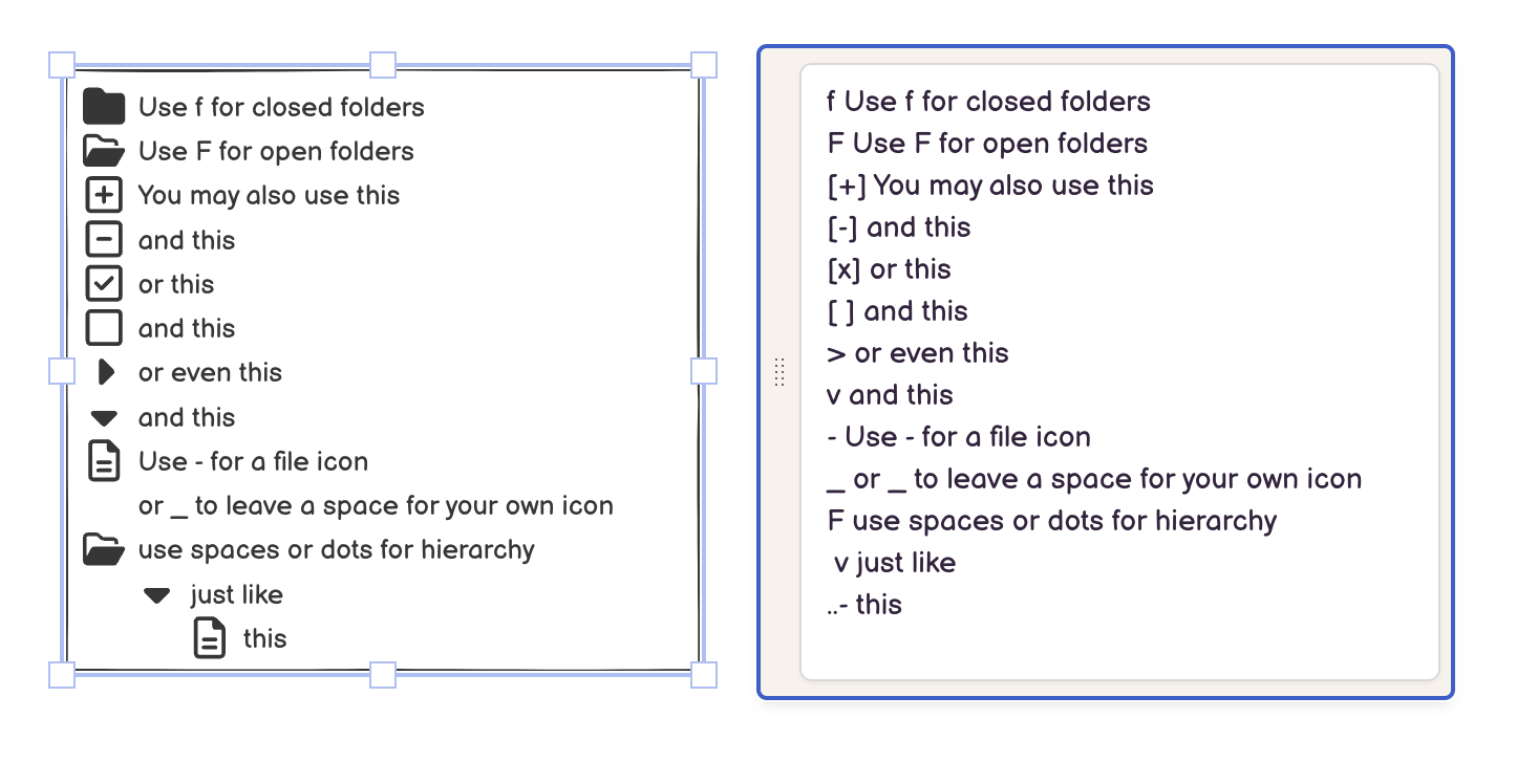
Note: Make sure to add a space between the icon indicator and the text after it (.e.g. "F folder name", not "Ffolder name").
To indent items, use a space or dot (".") for each level in the hierarchy you want to indent to.