Progress bars (also called loaders) are a type of feedback that lets the user know that the page or component is busy loading.
Applies to:


Why have progress bars?
In an ideal world, users would just click a button, the page would load instantly, and they would never have to wait. Unfortunately, this isn’t always the case.
When a user clicks a link, they expect the next page to load straight away. If it takes longer than expected, they need to be shown that the system is still working; otherwise, they might think that it has frozen or is broken.
This is where progress bars come in. These small animations let the user know that the system is still working, and they just need to wait a few seconds for it to be ready.
Types of progress bars
There are 2 types of progress bars: determinate and indeterminate. The former is used when the amount of information that needs to be loaded is detectable. The latter is used when the system is unsure how much needs to be loaded or how long it will take.
Determinate progress bars
For this type of loader, the amount of information loaded is known to the system and user. Usually, these types of loaders show a percentage value that increases over time.
Use a determinate progress bar when:
- The system can retrieve and display the progress without hampering the loading speed itself.
- A file is downloading.
- A file is uploading.
- A program is installing.
- A game or program is loading.
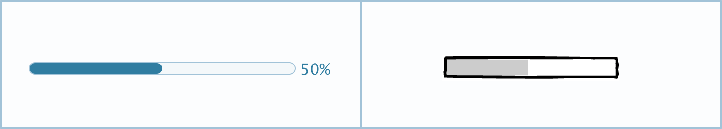
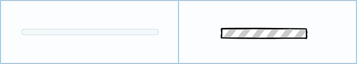
Indeterminate progress bars
Indeterminate progress bars can’t read how much of the operation is complete. These progress indicators are usually a looping animation that loops until the screen has loaded. The current progress value is undetermined.
Use an indeterminate progress bar when:
- Opening a new data-heavy page.
- The front end can’t determine how long the loading process will take.
Other types of indeterminate progress indicators include skeleton page loaders, loading animations, and spinners.
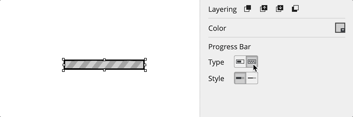
How to in Balsamiq You can switch between an indeterminate and a determinate progress bar in the Property Inspector.
Placement
The placement of a progress bar can make it more or less obvious to a user. As a general rule of thumb, pages with a short load time can have a more subtle loader, while pages with a lengthy load time need the progress bar to be more apparent.
With top navigation
Material Design has increased the popularity of the subtle progress bar at the top of the page. When a page is loading, a thin progress bar will appear at the top of the screen but below the main navigation or page title.
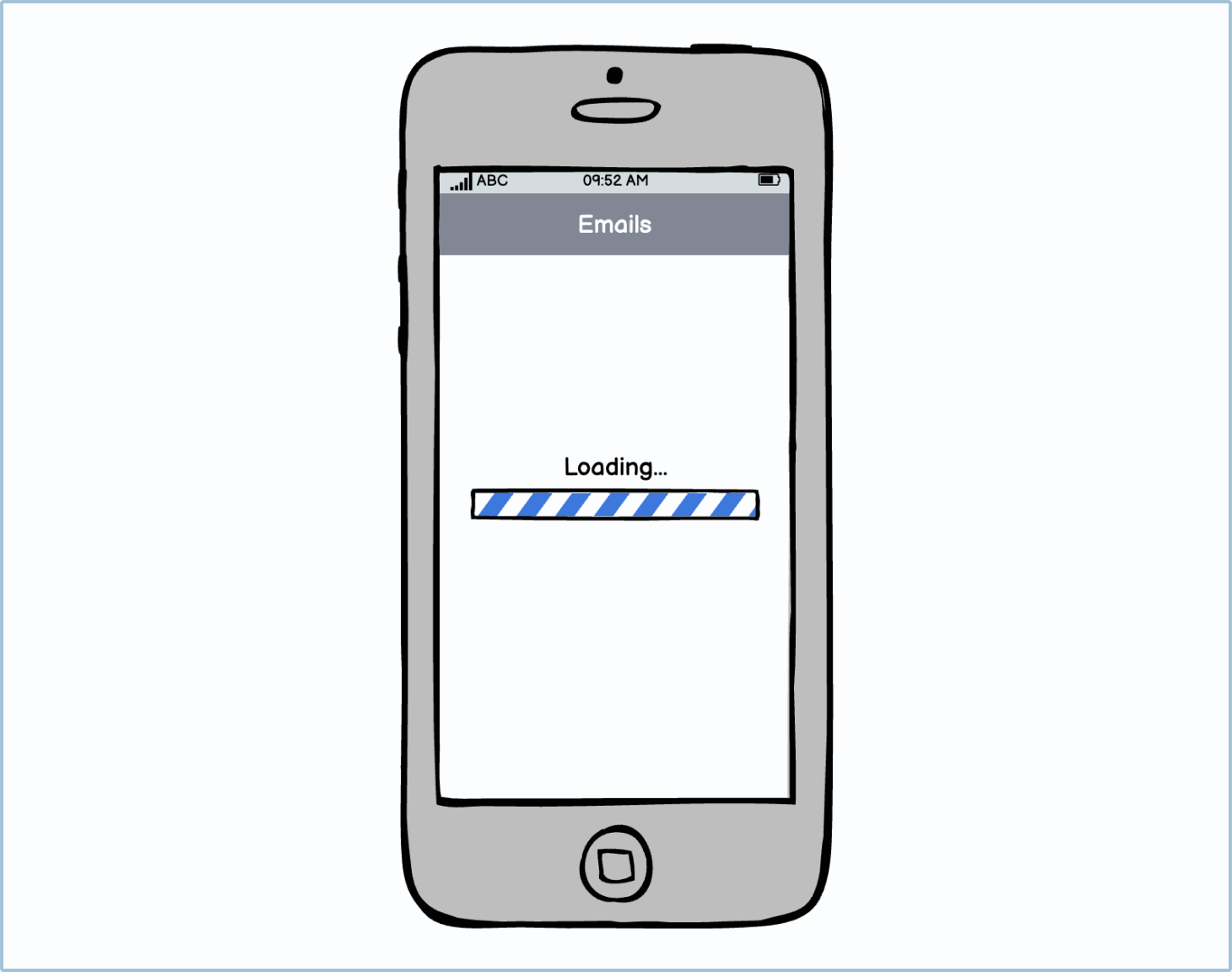
Center screen
Having the progress bar in the center of the screen is the least subtle way of showing a page is loading. Because it’s so apparent, it can be argued to be better for pages that have a long loading time.
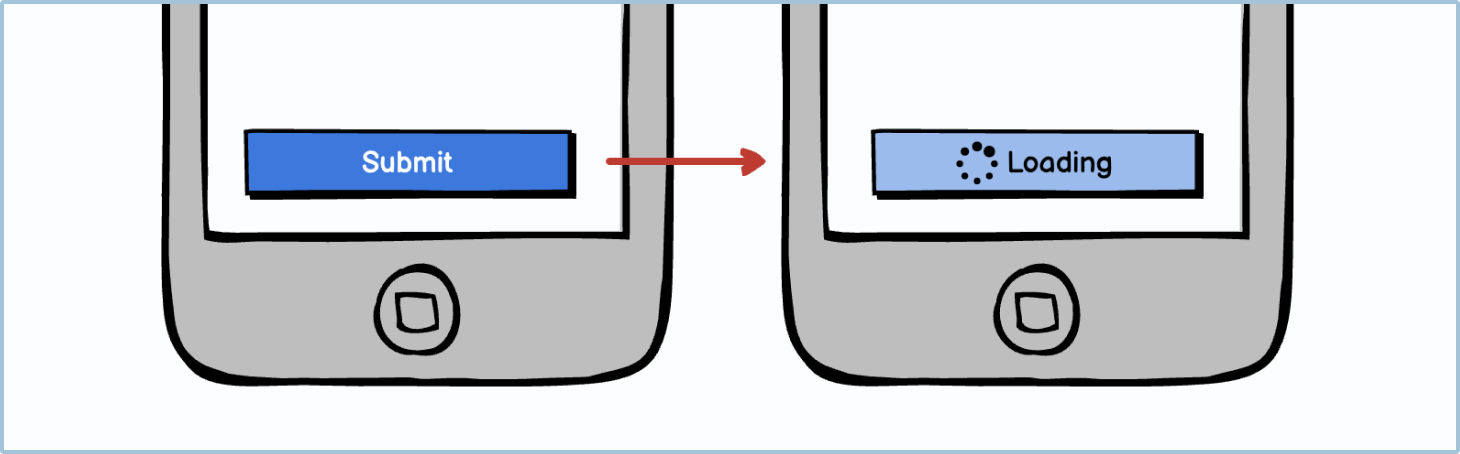
As a button
Buttons can become loaders themselves. If a user clicks a button, the button may change appearance and show a progress indicator. This will usually be the case if the button is submitting or uploading information to the platform.